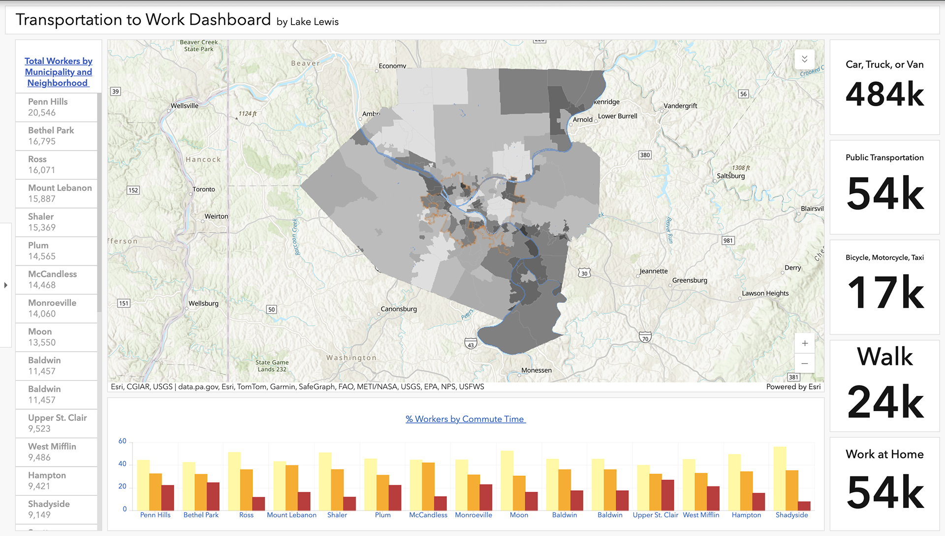
Transportation to Work Dashboard
Work environments across the world have changed drastically in the past few years, and will continue to change as organizations return to offices and physical workplaces. Changes to neighborhoods, central business districts, etc. will change based on worker locations. Hybrid modes of working from home, at headquarters, in satellite spaces, and beyond are being explored using data from the US Census Bureau, such as: means of transportation to work, time to work, and number of workers- to determine where infrastructure improvements are needed.
According to the US Census, Commuting (Journey to Work) refers to a worker's travel from home to work. Several Census include questions about the working population's commutes. Some of these questions include travel time, means of transportation, time of departure for work, vehicles available, and expenses associated with the commute. The ACS also asks workers about their place of work, the geographic location of their job. [1]
This dashboard explores means of transportation, commute times, and total workers for essential workers. The map shows the percentage of "essential workers" such as healthcare, protective services, food handlers, transportation, etc. American Community Survey data was obtained by block group (2016-2020) and aggregated to county municipalities and city neighborhoods. The average commuting time in the US is 26 minutes. Indicators in the dashboard reflect the values of each area selected from the list of total workers. A layer called HealthxWorkContour was created using GIS kernel density and shows areas of concentration for health to work variables, walk, bicycle, and bus. 2024
[1] https:/www.census.gov/topics/employment/commuting/guidance/commuting.html
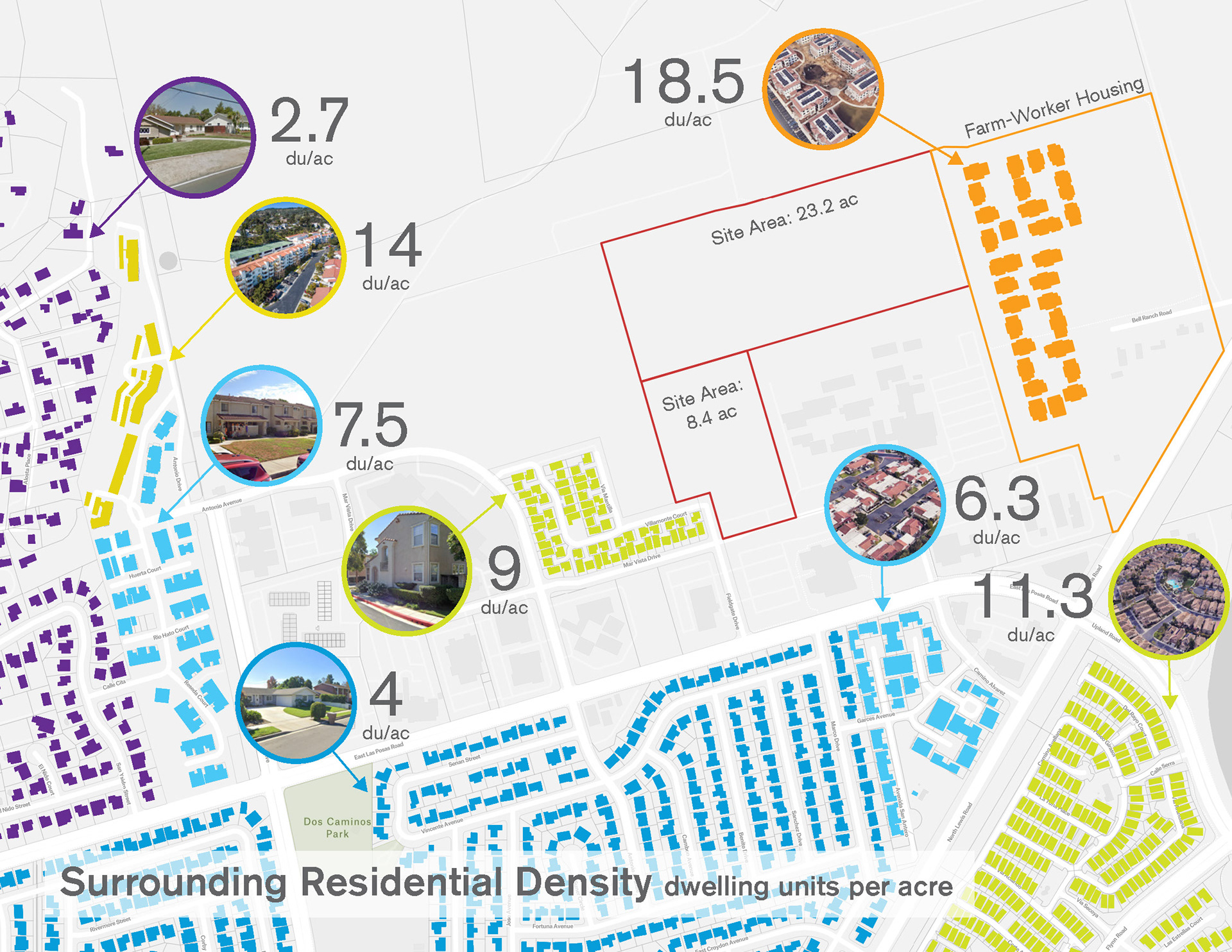
Residential density study in Camarillo, CA for education work-force housing. Made using Felt Maps and Adobe Illustrator. 2024 w/ KoningEizenberg.
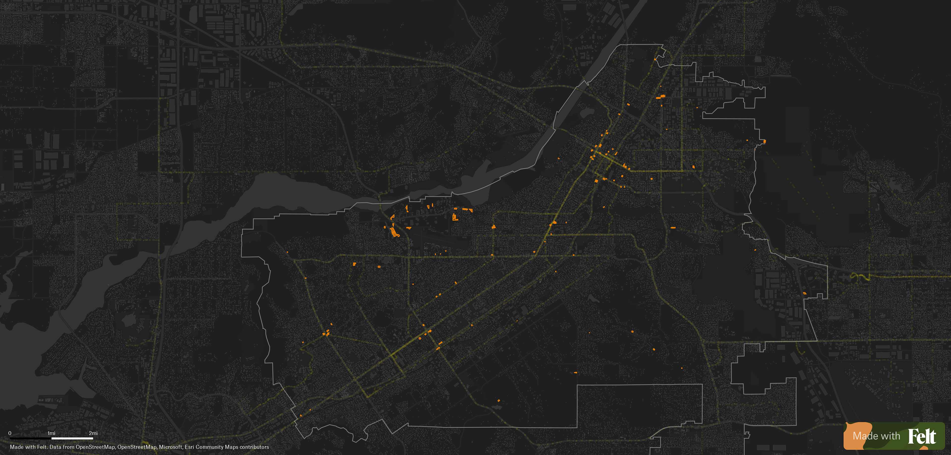
Vacant parcels (orange, 2019) & transit corridors (green, 2025) in the City of Riverside. The goal was to identify viable locations for “missing middle” affordable housing and demonstrate our ability to do so through layered visual mapping. Made using ArcGIS Pro, Felt Maps, and Adobe Illustrator. 2025 w/ KoningEizenberg.
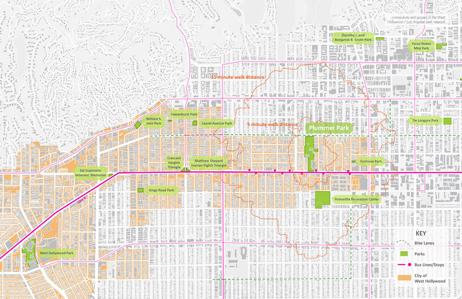
Isochrone transit map for Plummer Park Masterplan Request for Proposal in West Hollywood, CA. Made using ArcGIS Pro, Felt Maps, and Adobe Illustrator. 2024 w/ KoningEizenberg.